When reviewing performance upgrades or ECU tuning results, many people focus only on peak horsepower numbers. However, understanding how to read a dyno graph properly is essential to accurately evaluate real engine performance. A dyno sheet provides detailed insight into torque delivery, horsepower progression, and engine behavior across the RPM range.
In this guide, AutoExplain will explain how to read a dyno graph, break down its key components, and help you understand what the curves truly reveal about acceleration, drivability, and overall power output.
A dyno graph is a visual representation of engine performance measured on a dynamometer. It shows how much power and torque an engine produces across the RPM range during a controlled test run, commonly referred to as a “pull.”
A dynamometer (dyno) is a machine used to measure a vehicle’s power output. During performance testing or ECU tuning, the vehicle is placed on a dyno to record baseline power figures. After installing performance parts or modifying the ECU calibration, the vehicle is tested again to compare results. The dyno graph then displays the difference in horsepower and torque between runs.

While performing a dyno test, the operator monitors key engine parameters through diagnostic software to ensure consistent testing conditions. These typically include:
Maintaining stable environmental and engine conditions is critical to producing reliable and comparable dyno results.
On the X-axis of a dyno graph, you’ll find Engine Speed measured in revolutions per minute (RPM). RPM indicates how many times the engine’s crankshaft completes a full rotation every minute. Because the pistons are directly connected to the crankshaft, RPM also represents how quickly the pistons move up and down within the cylinders. As you move from left to right on the graph, RPM increases, showing how engine performance changes as speed rises.
On the Y-axis, you’ll find Engine Power, usually measured in horsepower (hp). Horsepower is a measurement of how much work the engine can perform over time. In simple terms, power reflects how efficiently the engine converts torque into usable performance at higher speeds. When reading a dyno graph, the horsepower value tells you the engine’s overall output capability across the RPM range.
During a dyno pull, tuners measure two main values: torque and horsepower. These are represented as two separate curves on the graph. Each curve shows how performance changes as engine speed increases.
The torque curve often rises sharply when the engine reaches full throttle. It may climb aggressively at first and then level off into a flatter shape before gradually tapering near higher RPM. Torque represents rotational force and plays a major role in acceleration and drivability.
The power curve has a different shape. It typically rises steadily as RPM increases because horsepower depends on both torque and engine speed. Even when torque begins to level off, horsepower may continue to climb until it reaches its peak closer to redline.
You may notice that the dyno graph lines do not begin at 0 RPM. Instead, they start within a specific operating range known as the Rev Range. This range begins when the tuner applies full throttle during the dyno pull and continues until the engine approaches its maximum safe RPM.
Redline represents the engine’s upper operating limit. It is the maximum RPM the engine can safely reach without risking mechanical damage. When the dyno graph lines suddenly drop, it usually indicates that the operator has reached redline and lifted off the throttle, ending the test run.
The Powerband refers to the RPM range where the engine produces strong and usable performance. It is typically located between the point of peak torque and peak horsepower. Peak torque is usually identified where the torque curve reaches its highest value and begins to level out, while peak horsepower appears near the top of the RPM range before the power curve declines.
Understanding the powerband helps drivers and tuners determine where the engine performs most effectively and how it delivers power throughout the rev range.
A dyno sheet without a baseline comparison has very limited value. Dyno numbers on their own do not tell the full story. Different dynos can produce different readings, and even the same dyno may show variations depending on environmental conditions and testing methods. For this reason, it is important to compare results against an initial baseline run performed under consistent conditions.
Every dyno operator may configure tests slightly differently. Factors such as gear selection, correction standards, ambient temperature, tire pressure, and vehicle setup can all influence the final numbers. When reviewing dyno results, always confirm that the before-and-after runs were performed on the same dyno, in the same gear, and under similar environmental conditions. Without this consistency, the comparison may not accurately reflect true performance gains.
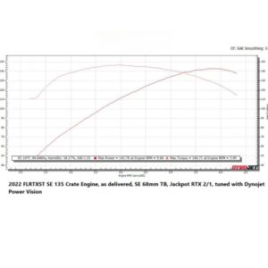
Let’s look at an example of a dyno sheet to better understand how to interpret the results.
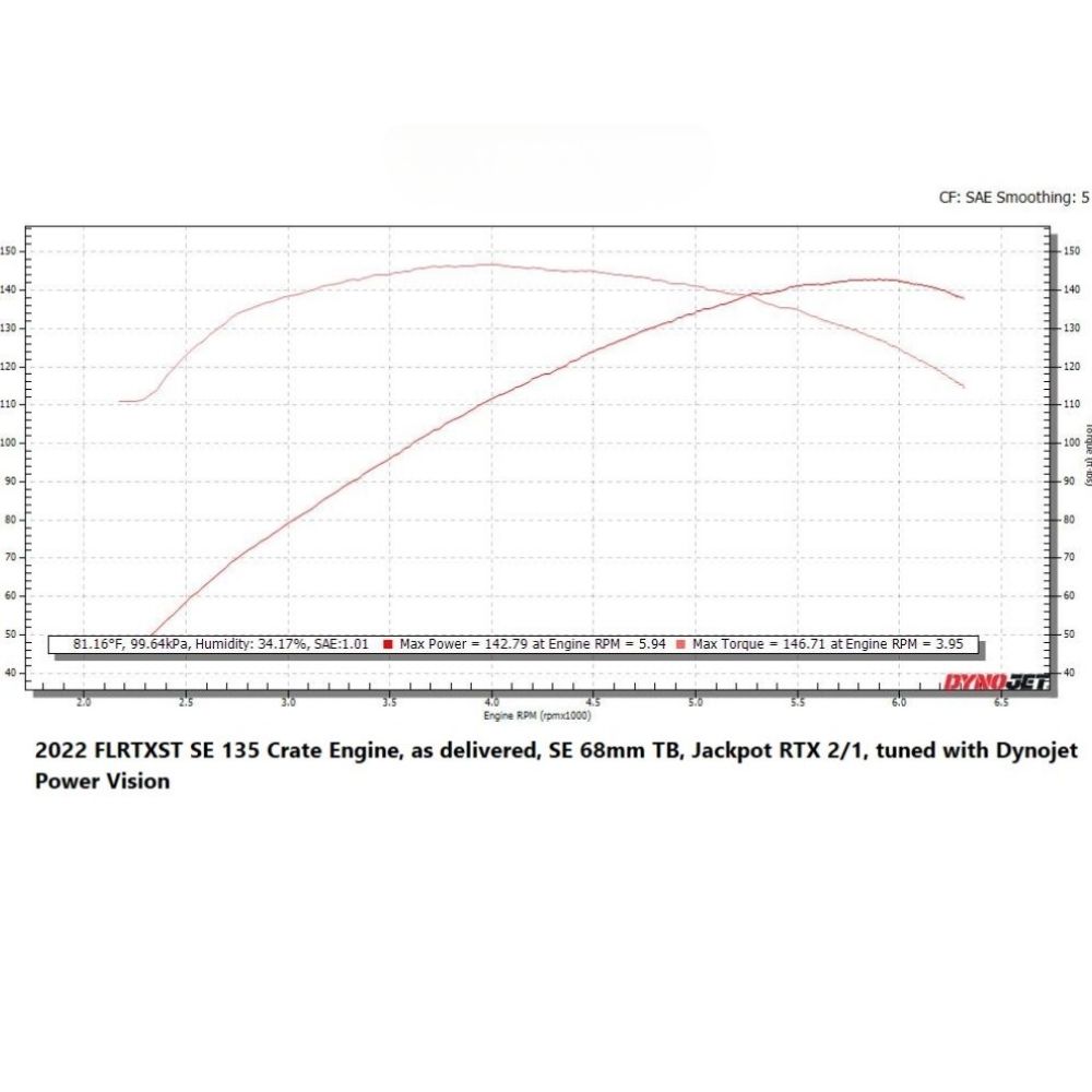
This dyno graph example compares two runs performed on the same vehicle. When analyzing a dyno sheet, we focus on two primary curves: the Torque Curve and the Power Curve. Some dyno operators display these on separate sheets, while others combine both curves onto a single graph.
First, let’s look at the Torque Curve. As explained earlier, torque graphs are typically recognized by a steep rise followed by a plateau. This characteristic shape exists because internal combustion engines are not 100% volumetrically efficient. Peak torque generally occurs where the engine reaches its highest efficiency in filling the cylinders with air and fuel.
In this example, the RPM range measured is between 2250 RPM and 8500 RPM. The baseline run is represented by one line, while the modified setup is represented by another. By comparing the two curves, we can clearly see where gains occur throughout the rev range.
At a specific point in the mid-range RPM, torque increases significantly compared to the baseline. Peak torque occurs higher in the rev range, and gains continue even beyond that peak before tapering near redline. These torque gains are what drivers physically feel when accelerating. Torque is responsible for that strong pull in the seat—the sensation often described as “grunt” or “raw power.” It directly influences how quickly the car responds when the throttle is applied.

Now let’s examine the Power Curve. The power curve typically climbs steadily as RPM increases before gradually tapering near redline. Because horsepower is calculated from torque and engine speed, it usually peaks later in the rev range than torque.
Using the same RPM range of 2250 RPM to 8500 RPM, we compare the baseline and modified runs. The graph shows a noticeable horsepower increase at higher RPM, with peak power occurring near the top of the rev range. This indicates that the modifications not only improved mid-range performance but also enhanced high-RPM efficiency.
Power represents the rate at which work is done. While torque is the rotational force that moves the vehicle, horsepower is that force applied over time. Mathematically, horsepower is calculated as:
HP = (Torque × RPM) ÷ 5252
This relationship explains why horsepower continues rising even after torque peaks—because RPM is still increasing.
Higher horsepower allows the vehicle to overcome increasing resistance at higher speeds, such as aerodynamic drag and rolling resistance. This ultimately contributes to improved top-end performance and overall acceleration capability.
When analyzing both curves together, the full story becomes clearer. Increased torque improves acceleration and responsiveness, while increased horsepower enhances high-RPM performance and top speed potential. A proper dyno analysis always looks at the relationship between torque, power, and RPM—not just peak numbers alone.

Understanding how to interpret these graphs allows you to evaluate whether a modification improves drivability, high-RPM performance, or both.
Learning how to read a dyno graph is about more than looking at peak horsepower numbers. A proper dyno analysis requires understanding RPM range, torque delivery, horsepower progression, and how both curves interact across the rev range. Without a consistent baseline and controlled testing conditions, dyno results can be misleading.
Understanding dyno graphs allows you to make informed decisions about upgrades, tuning strategies, and performance goals—based on data, not just numbers. At AutoExplain, our goal is to help enthusiasts and professionals understand performance data clearly so they can make smarter, more informed tuning decisions.
You can see more our service: ECU TUNING SERVICE